Bankly: Digitizing Cash, Building Connections
Bankly is a fintech company headquartered in Lagos, Nigeria, that has been transforming the lives of Nigeria’s 47.4M financially underserved adults since its launch in 2017. With the goal of making financial services more accessible, Bankly created a network of direct and partner agents to digitize cash and reduce the risks associated with physical savings—such as fraud, theft, and losses. After securing $2 million in seed funding, Bankly needed a fresh, strong brand identity to scale its operations and grow its 35,000-strong customer base in cash-dependent communities.
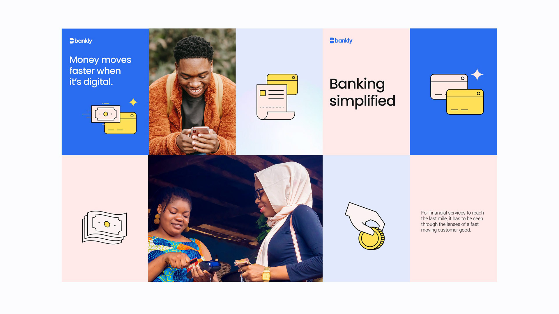
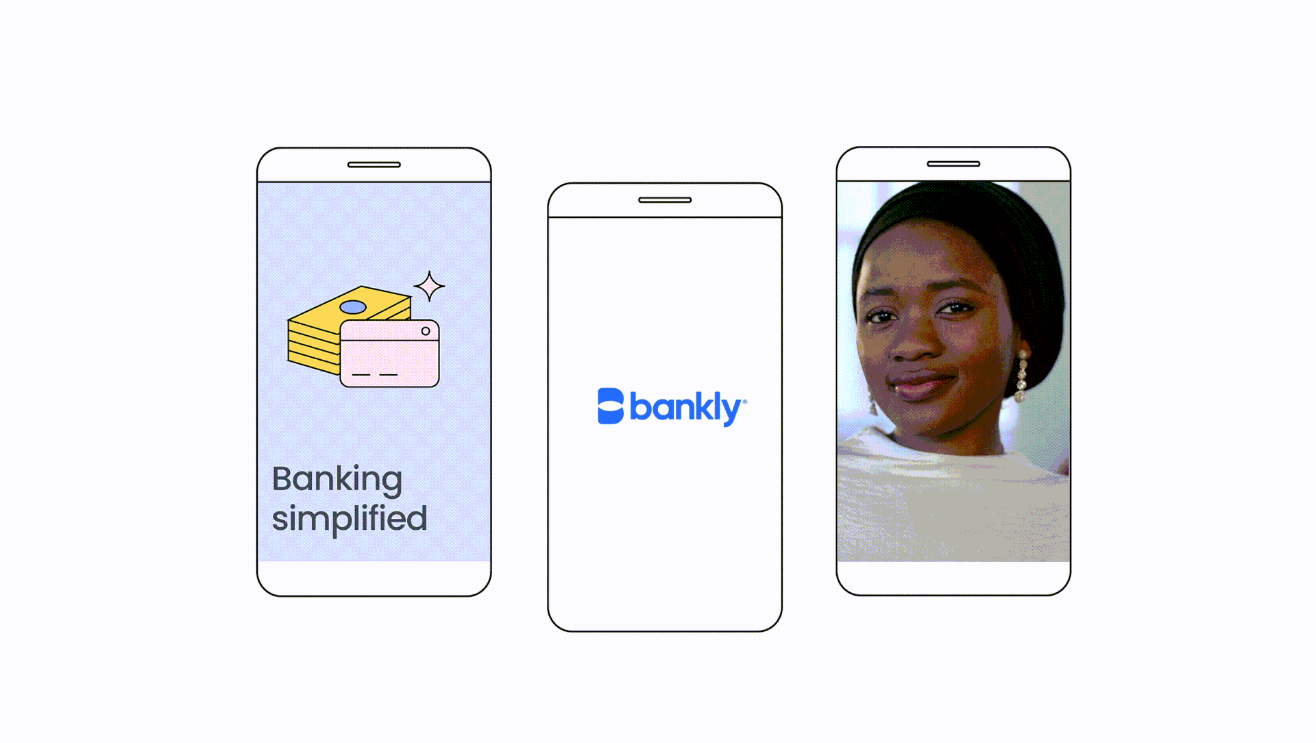
When I was tasked with leading the rebrand, the focus was clear: to highlight Bankly’s mission to bring the unbanked into the digital economy while reflecting its core values of connection, community, and simplicity.
The Bankly Portal
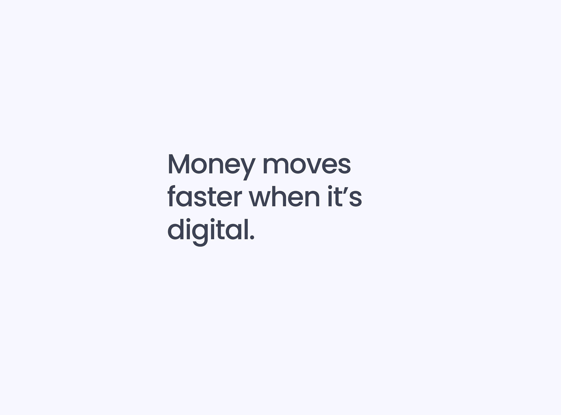
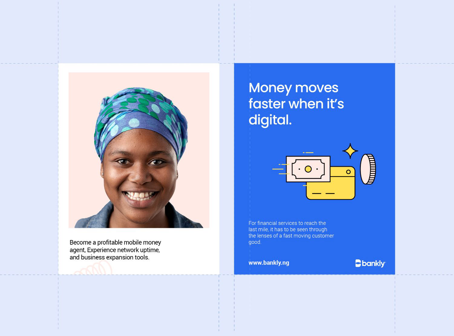
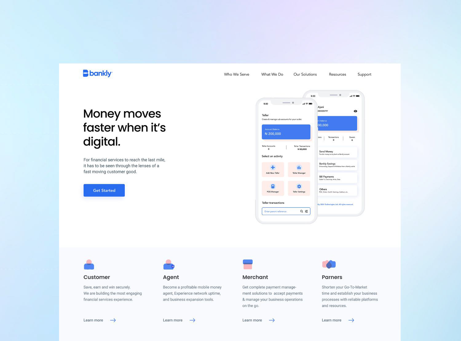
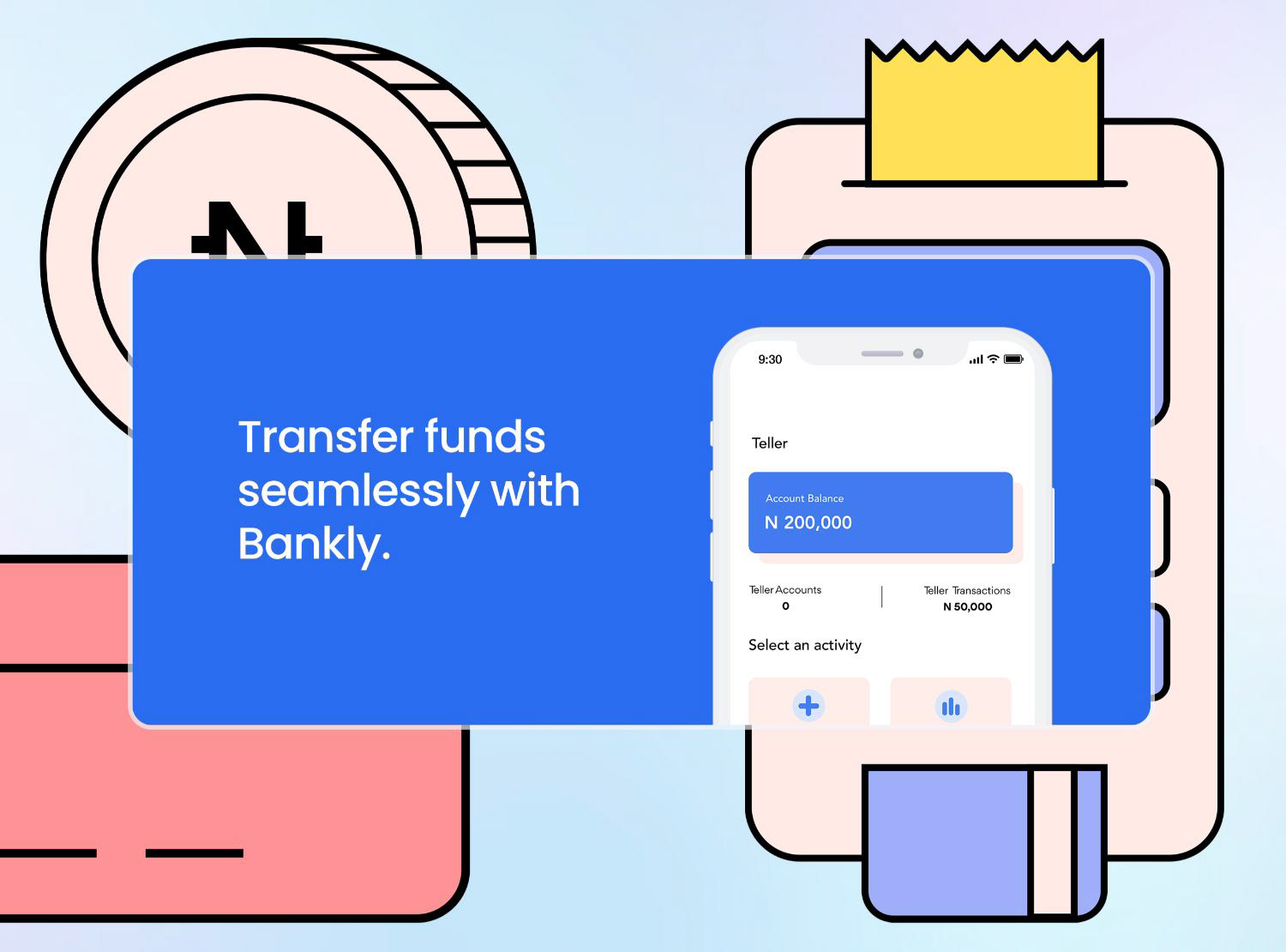
The idea of a "portal" became central to the new identity, representing a gateway that transforms physical cash into a more secure digital form. This concept of digitization aligned perfectly with Bankly’s mission to make money move faster and safer. I used the portal as a visual metaphor for this digital transformation, emphasizing the transcendence from cash to digital.
The idea of a "portal" became central to the new identity, representing a gateway that transforms physical cash into a more secure digital form. This concept of digitization aligned perfectly with Bankly’s mission to make money move faster and safer. I used the portal as a visual metaphor for this digital transformation, emphasizing the transcendence from cash to digital.
Connection Through Intersection
The second key theme driving the rebrand was "connection." This was symbolized by the idea of an intersection—a meeting point that represents the connections Bankly facilitates between people, communities, and financial services. By simplifying the concept of intersection into flat illustrations and iconography, I was able to visually reinforce Bankly’s role in making banking simpler, more accessible, and more connected for its users.
The second key theme driving the rebrand was "connection." This was symbolized by the idea of an intersection—a meeting point that represents the connections Bankly facilitates between people, communities, and financial services. By simplifying the concept of intersection into flat illustrations and iconography, I was able to visually reinforce Bankly’s role in making banking simpler, more accessible, and more connected for its users.
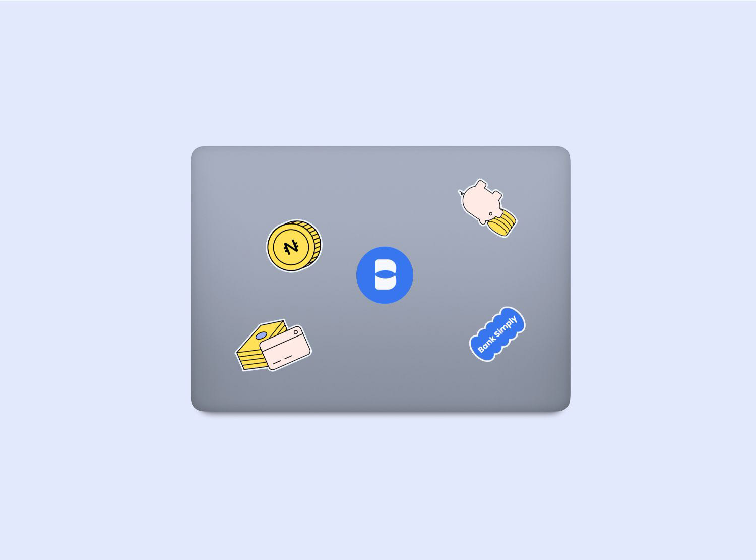
Vibrancy, Strength, and Simplicity
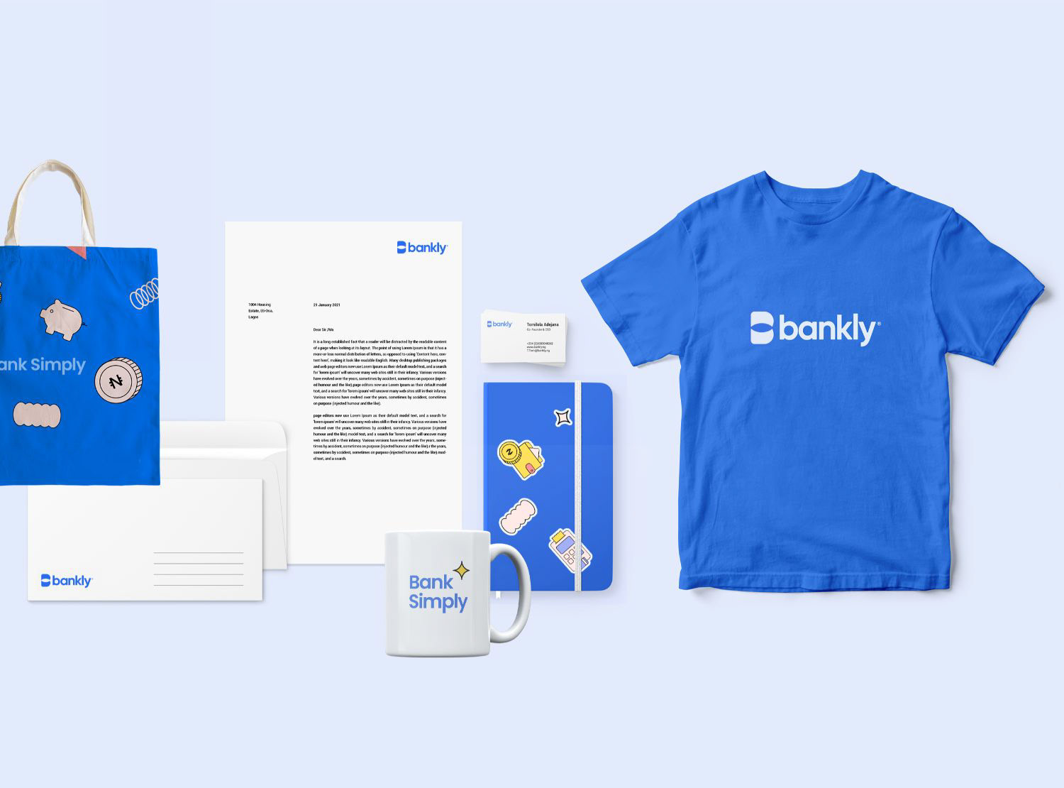
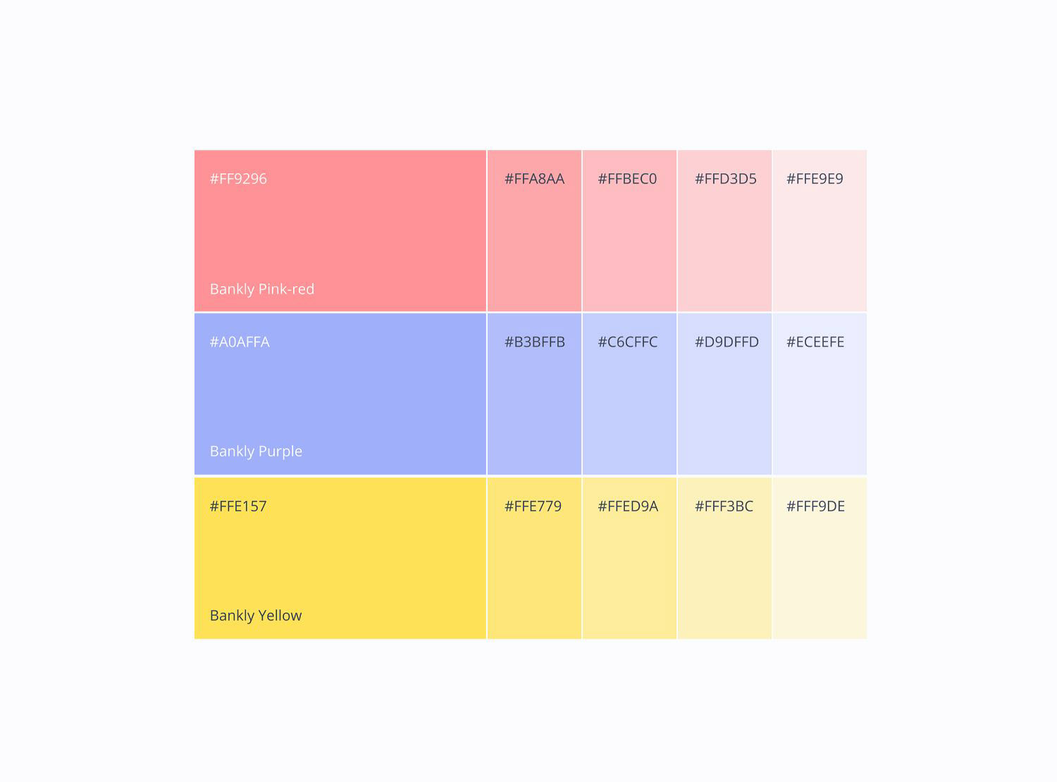
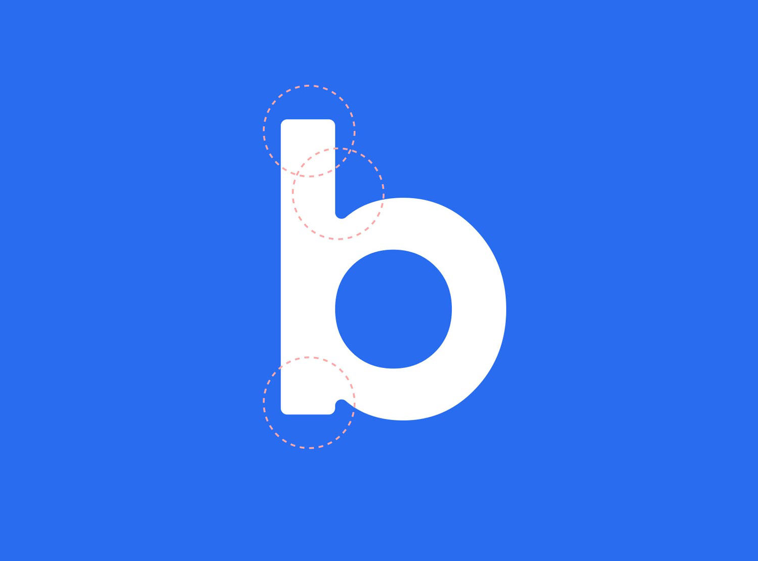
To reflect Bankly’s vibrancy and strength, I developed a color palette inspired by nature—pulling earthy tones from the land, sea, sky, and vegetation. The previous shade of blue was adjusted to a bolder tone, signifying depth, trust, transparency, and confidence. Blue’s association with intelligence and unity made it the perfect base color to carry the new identity forward. This new look gave Bankly the boldness and visibility needed to stand out while staying true to its values.
To reflect Bankly’s vibrancy and strength, I developed a color palette inspired by nature—pulling earthy tones from the land, sea, sky, and vegetation. The previous shade of blue was adjusted to a bolder tone, signifying depth, trust, transparency, and confidence. Blue’s association with intelligence and unity made it the perfect base color to carry the new identity forward. This new look gave Bankly the boldness and visibility needed to stand out while staying true to its values.
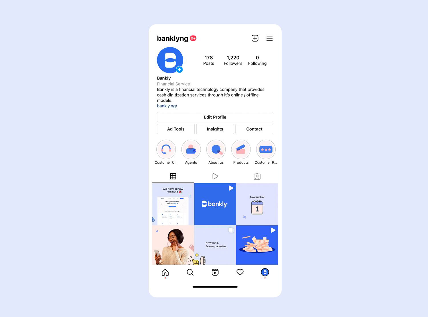
The result was a design system built on simplicity and strength, symbolizing Bankly’s commitment to building trust, enhancing connections, and helping more people step into the digital financial world.