Reimagining What It Means to Invest
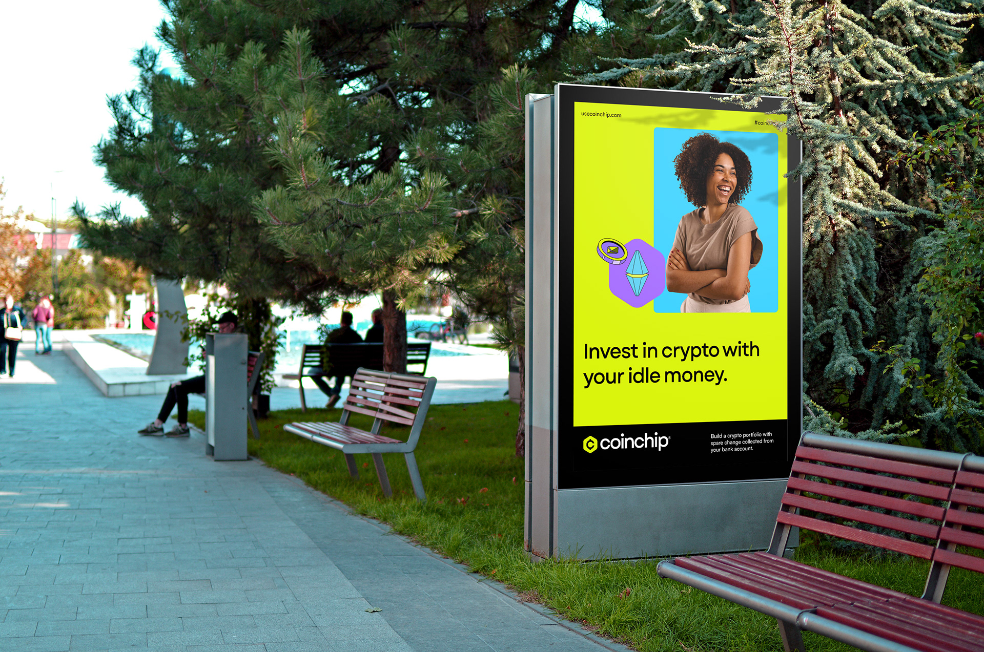
Cryptocurrency trading has often been perceived as complex, inaccessible, and expensive by many. When I worked on Coinchip, a platform designed to simplify crypto investing, the challenge was clear: create a visual identity that resonates with everyday individuals, regardless of their crypto literacy. Coinchip, acting as a DeFi intermediary, helps users build a robust crypto portfolio using spare change from their bank accounts. The app’s focus on simplicity, ease of access, and innovation inspired me to design a brand identity that reflected these core values.
Cryptocurrency trading has often been perceived as complex, inaccessible, and expensive by many. When I worked on Coinchip, a platform designed to simplify crypto investing, the challenge was clear: create a visual identity that resonates with everyday individuals, regardless of their crypto literacy. Coinchip, acting as a DeFi intermediary, helps users build a robust crypto portfolio using spare change from their bank accounts. The app’s focus on simplicity, ease of access, and innovation inspired me to design a brand identity that reflected these core values.
A Chip off the Block
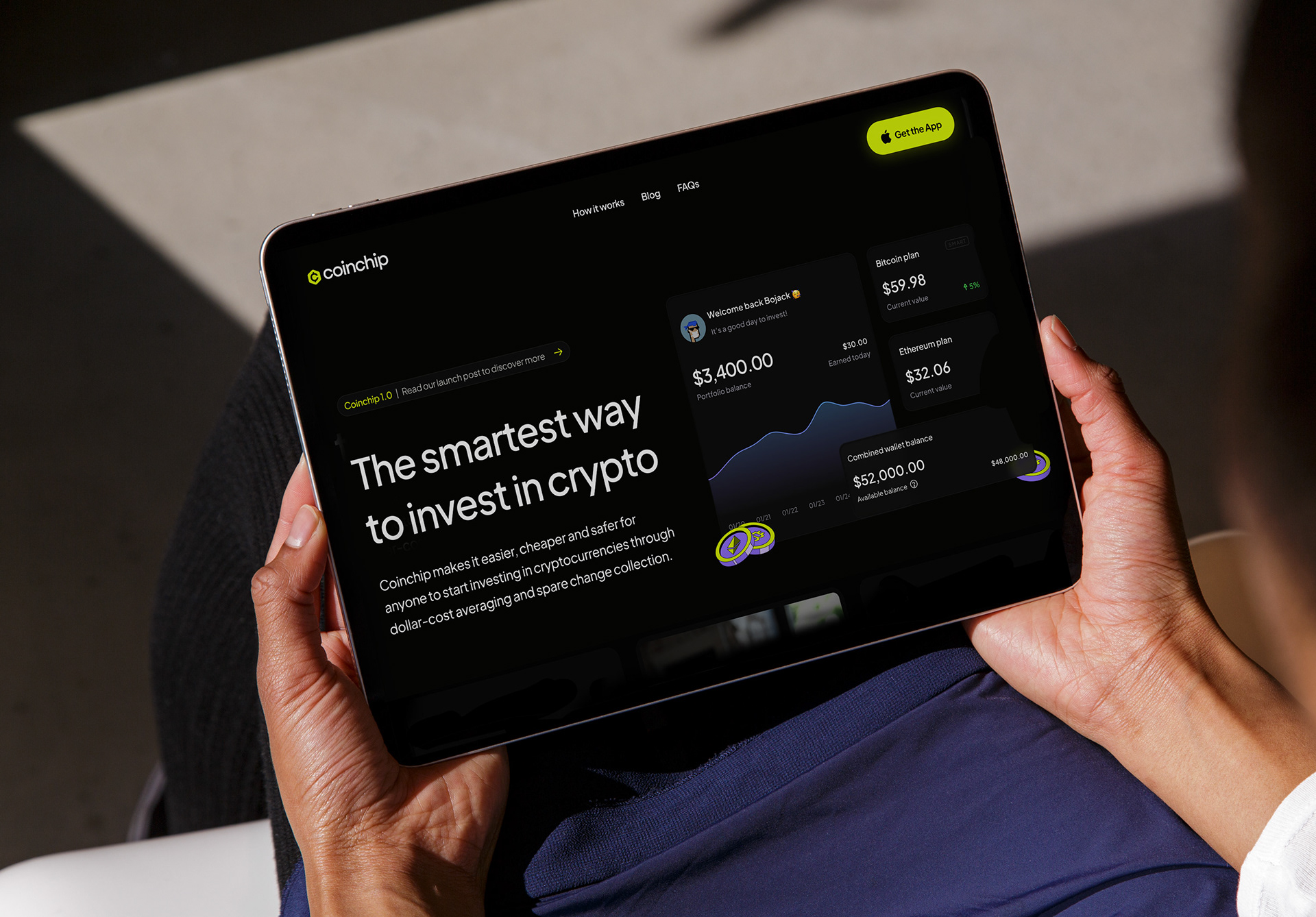
After collaborating with the founders, I quickly understood that Coinchip’s key offering was making crypto accessible, starting with as little as $1. This affordability and simplicity were central to the brand’s identity, and from this concept, Coinchip was born—helping users invest small "chips" of their money into digital assets.
After collaborating with the founders, I quickly understood that Coinchip’s key offering was making crypto accessible, starting with as little as $1. This affordability and simplicity were central to the brand’s identity, and from this concept, Coinchip was born—helping users invest small "chips" of their money into digital assets.
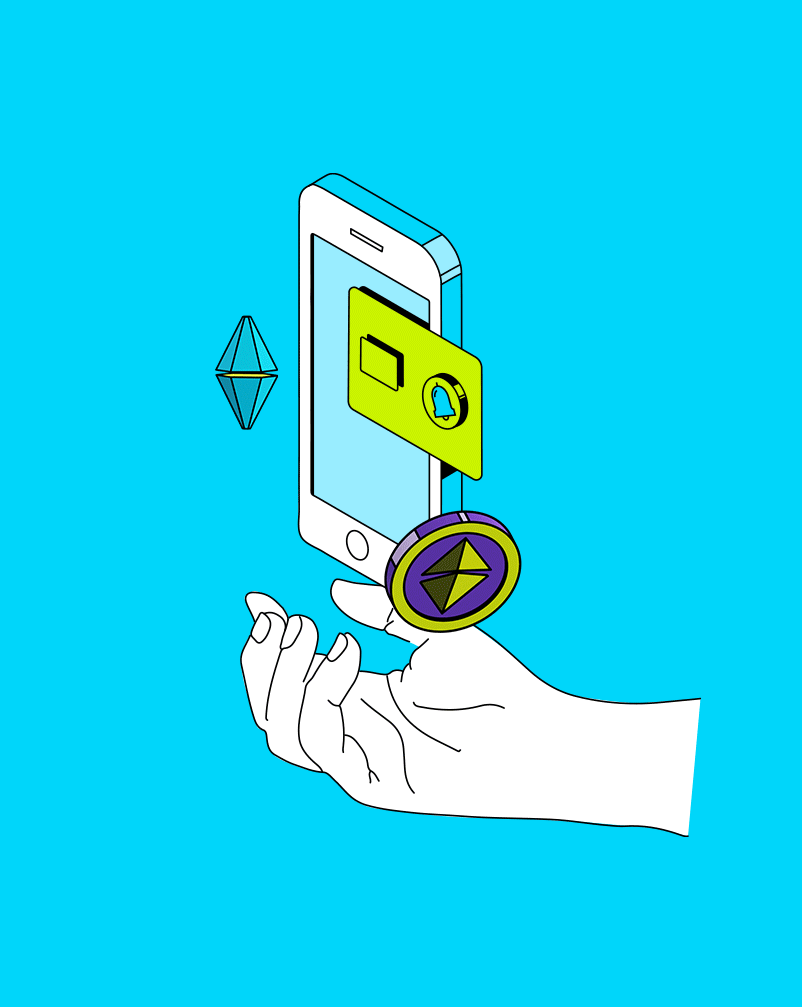
Vault-Level Safety
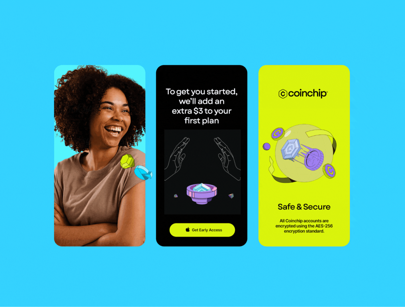
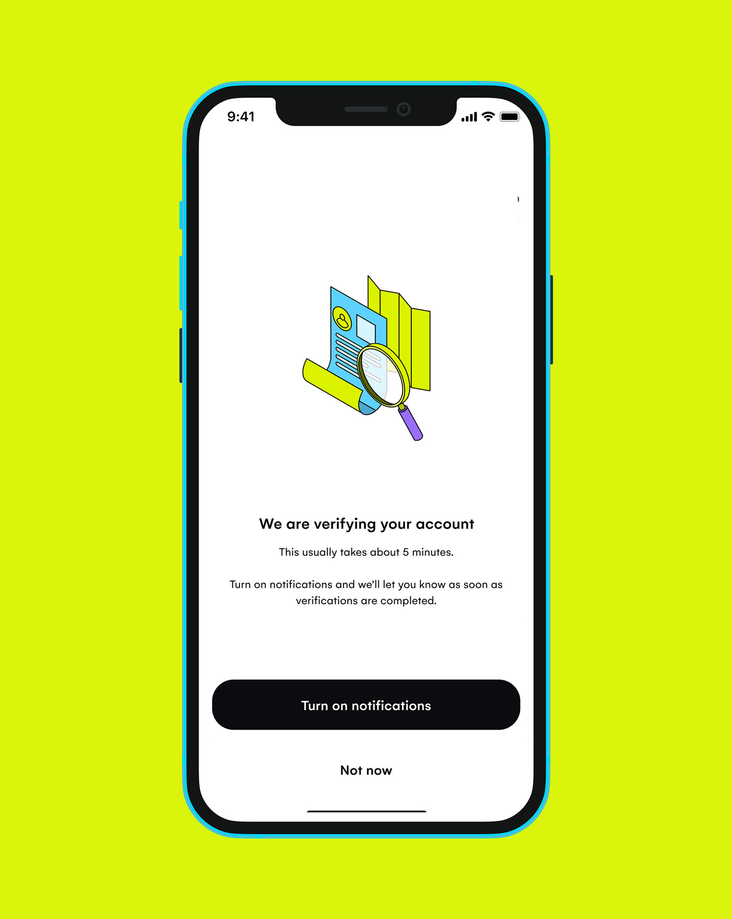
Security was also a key feature of the platform. Coinchip’s investment strategies and dollar-cost averaging allow users to maximize returns while minimizing risk. To convey this sense of security, I designed the brand logo with a hexagonal vault, representing strength and stability, and styled it to resemble currency—instantly communicating the trustworthiness of Coinchip’s approach.
Security was also a key feature of the platform. Coinchip’s investment strategies and dollar-cost averaging allow users to maximize returns while minimizing risk. To convey this sense of security, I designed the brand logo with a hexagonal vault, representing strength and stability, and styled it to resemble currency—instantly communicating the trustworthiness of Coinchip’s approach.
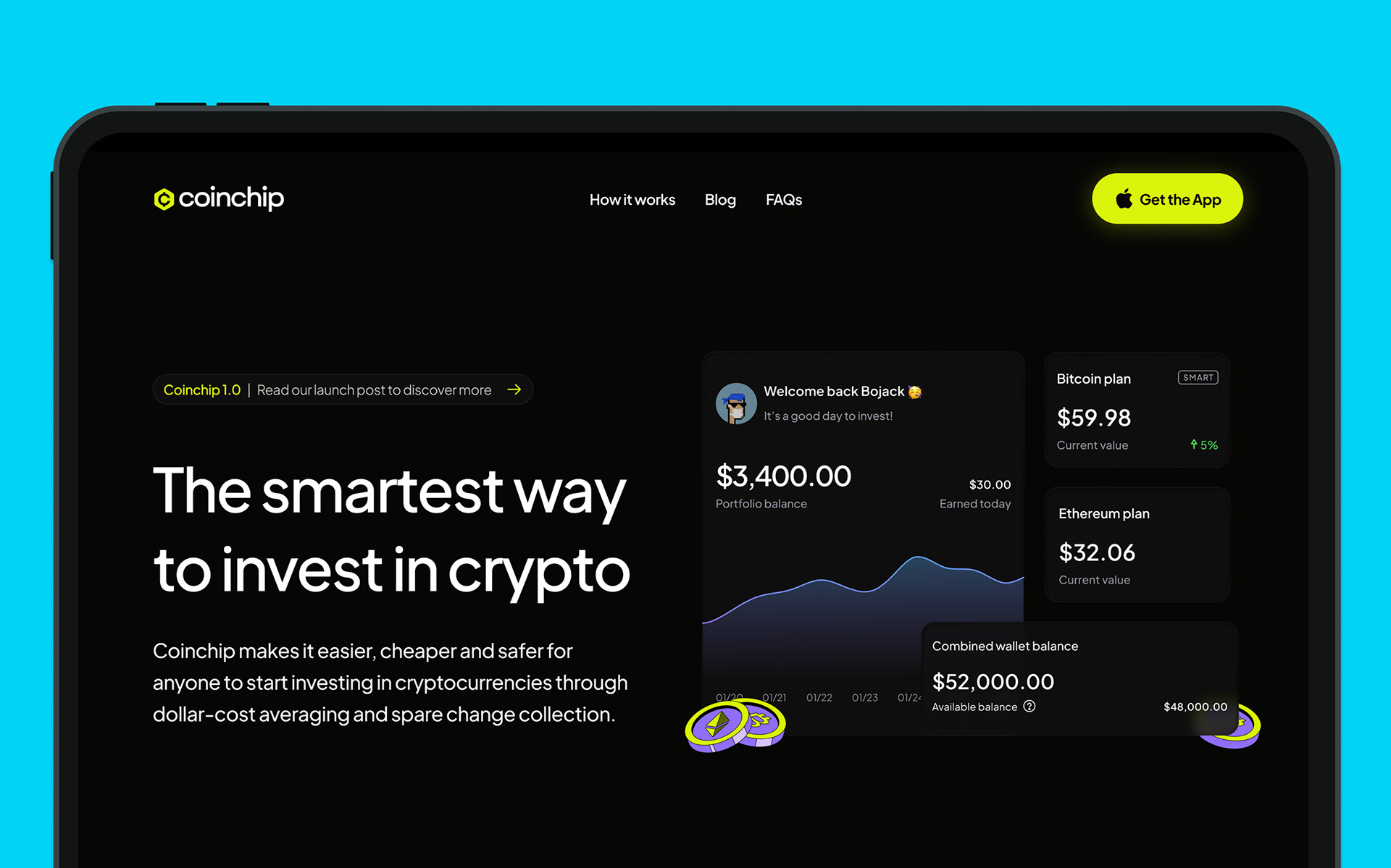
The Coinchip Standard
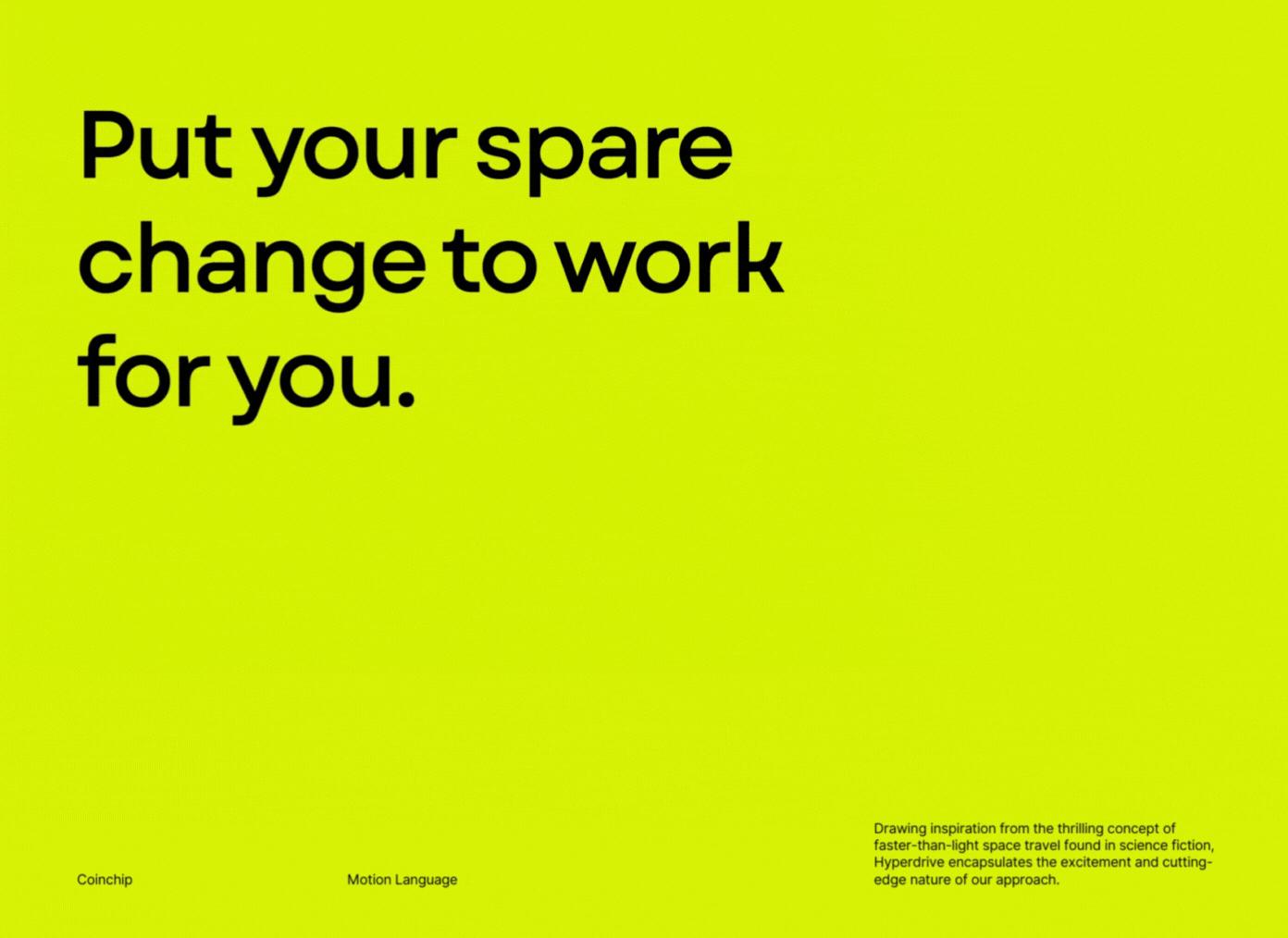
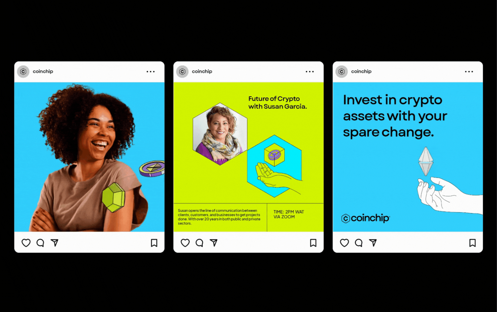
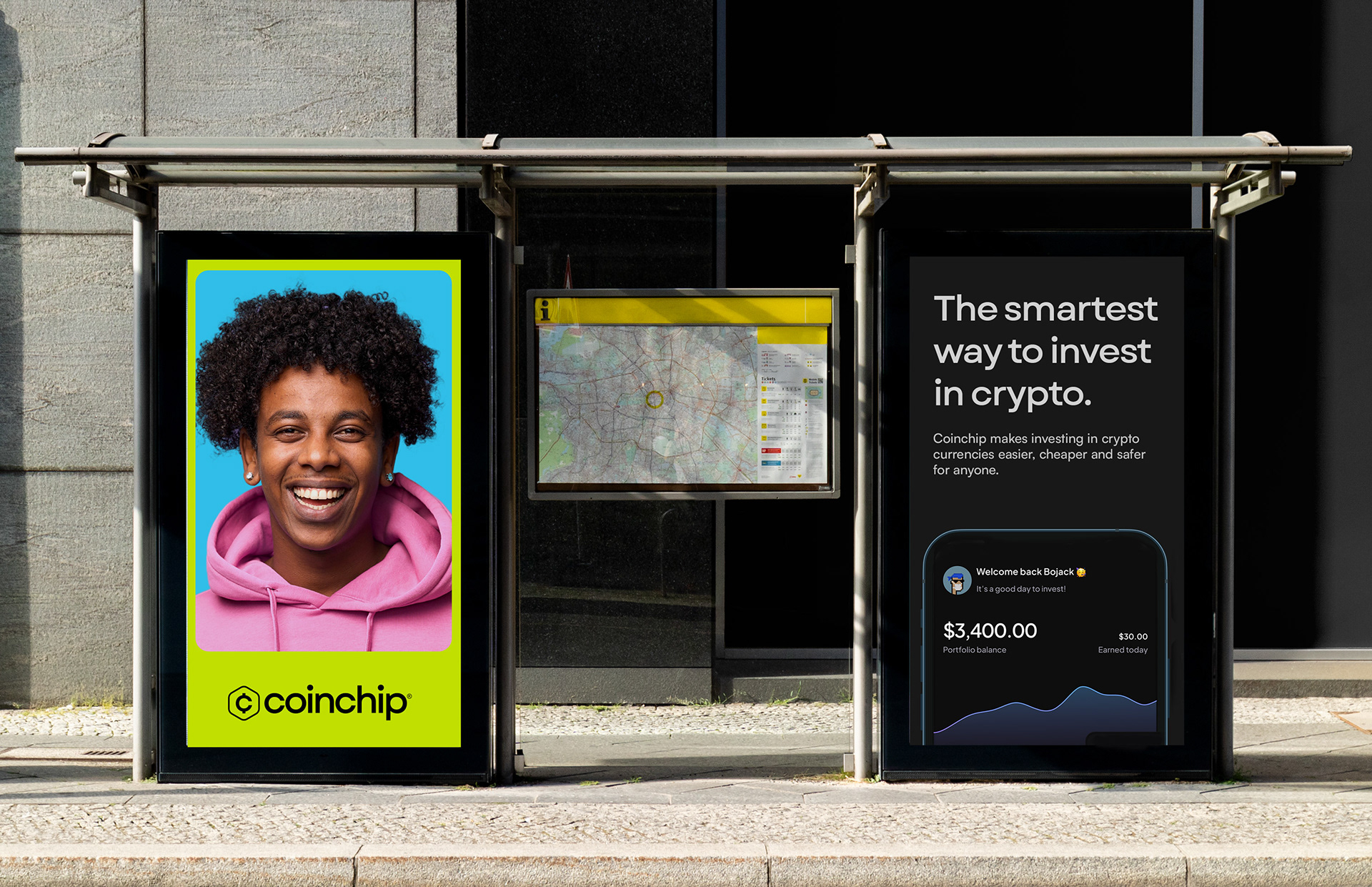
With the fintech space saturated with crypto products, Coinchip needed to stand out. I created a unique visual identity using Chartreuse and Black as primary colors—breaking away from the blue-dominated industry palette. To complement this, I introduced secondary colors like Lilac, Vivid Sky, and Light Coral, all chosen for their simplicity and brilliance. For typography, I selected Garet, a geometric typeface that strikes the perfect balance between friendliness and professionalism, with its modern oval shapes adding character and formality.
With the fintech space saturated with crypto products, Coinchip needed to stand out. I created a unique visual identity using Chartreuse and Black as primary colors—breaking away from the blue-dominated industry palette. To complement this, I introduced secondary colors like Lilac, Vivid Sky, and Light Coral, all chosen for their simplicity and brilliance. For typography, I selected Garet, a geometric typeface that strikes the perfect balance between friendliness and professionalism, with its modern oval shapes adding character and formality.
The Pièce de Résistance
What makes Coinchip truly brilliant is its ability to simplify the complex world of crypto while bridging decentralized and centralized systems. In designing the brand’s motion graphics, I adopted the "Hyperdrive" concept from sci-fi, symbolizing the platform’s futuristic and innovative approach to trading. This design choice, with its fluid motion and sleek reveals, visually communicates Coinchip’s sophistication, security, and forward-thinking vision.
What makes Coinchip truly brilliant is its ability to simplify the complex world of crypto while bridging decentralized and centralized systems. In designing the brand’s motion graphics, I adopted the "Hyperdrive" concept from sci-fi, symbolizing the platform’s futuristic and innovative approach to trading. This design choice, with its fluid motion and sleek reveals, visually communicates Coinchip’s sophistication, security, and forward-thinking vision.


In designing the brand’s motion graphics, I adopted the "Hyperdrive" concept from sci-fi, symbolizing the platform’s futuristic and innovative approach to trading. This design choice, with its fluid motion and sleek reveals, visually communicates Coinchip’s sophistication, security, and forward-thinking vision.
This unique design approach is marked by the graceful flow of motion, dynamic streaks of light, and an intriguingly sudden reveal. These elements collectively convey an air of sophistication, technological prowess, and unwavering security, all in alignment with the visionary ethos and ambition of Coinchip.
This unique design approach is marked by the graceful flow of motion, dynamic streaks of light, and an intriguingly sudden reveal. These elements collectively convey an air of sophistication, technological prowess, and unwavering security, all in alignment with the visionary ethos and ambition of Coinchip.