Elevating Investment with Consonance
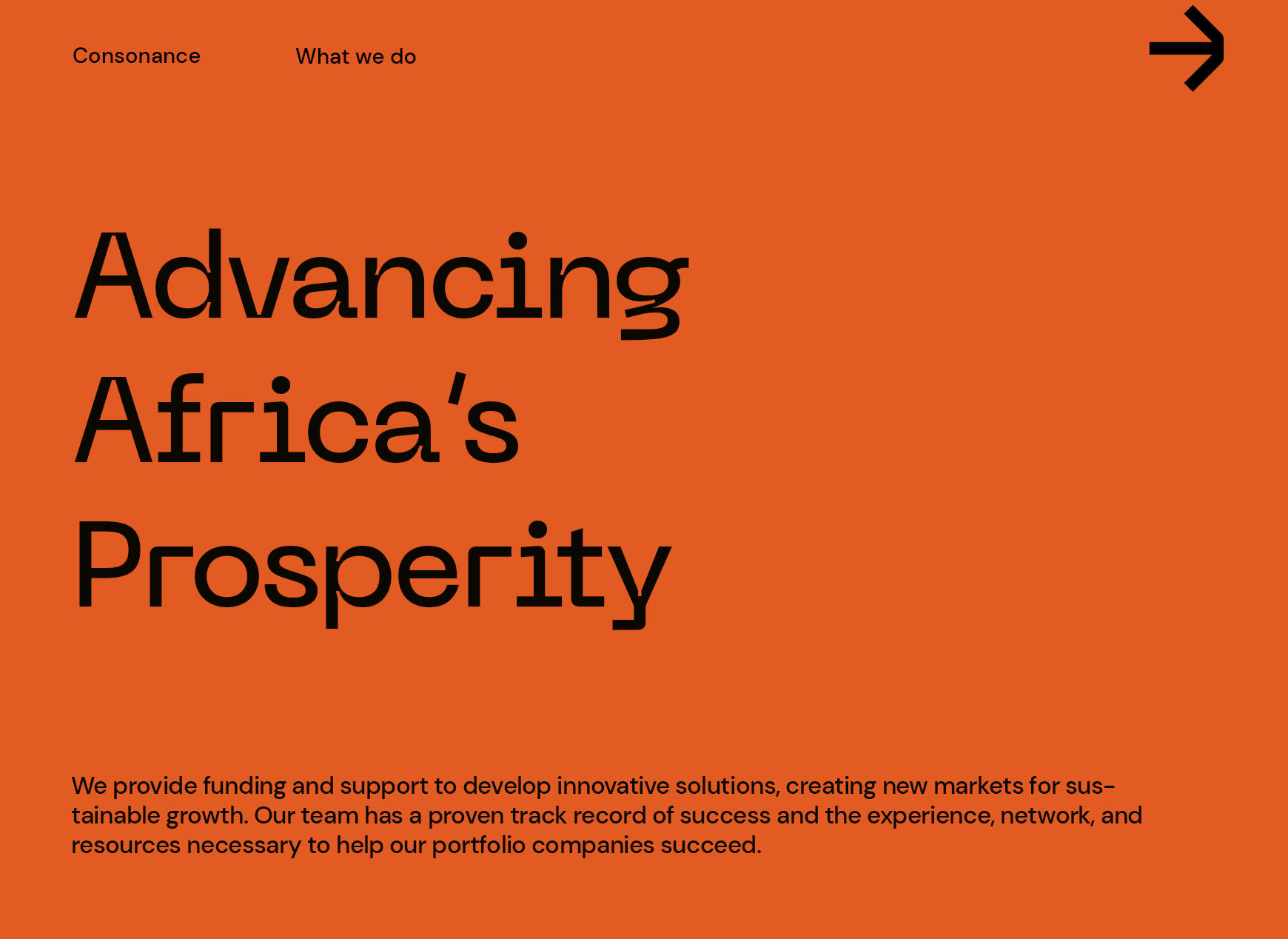
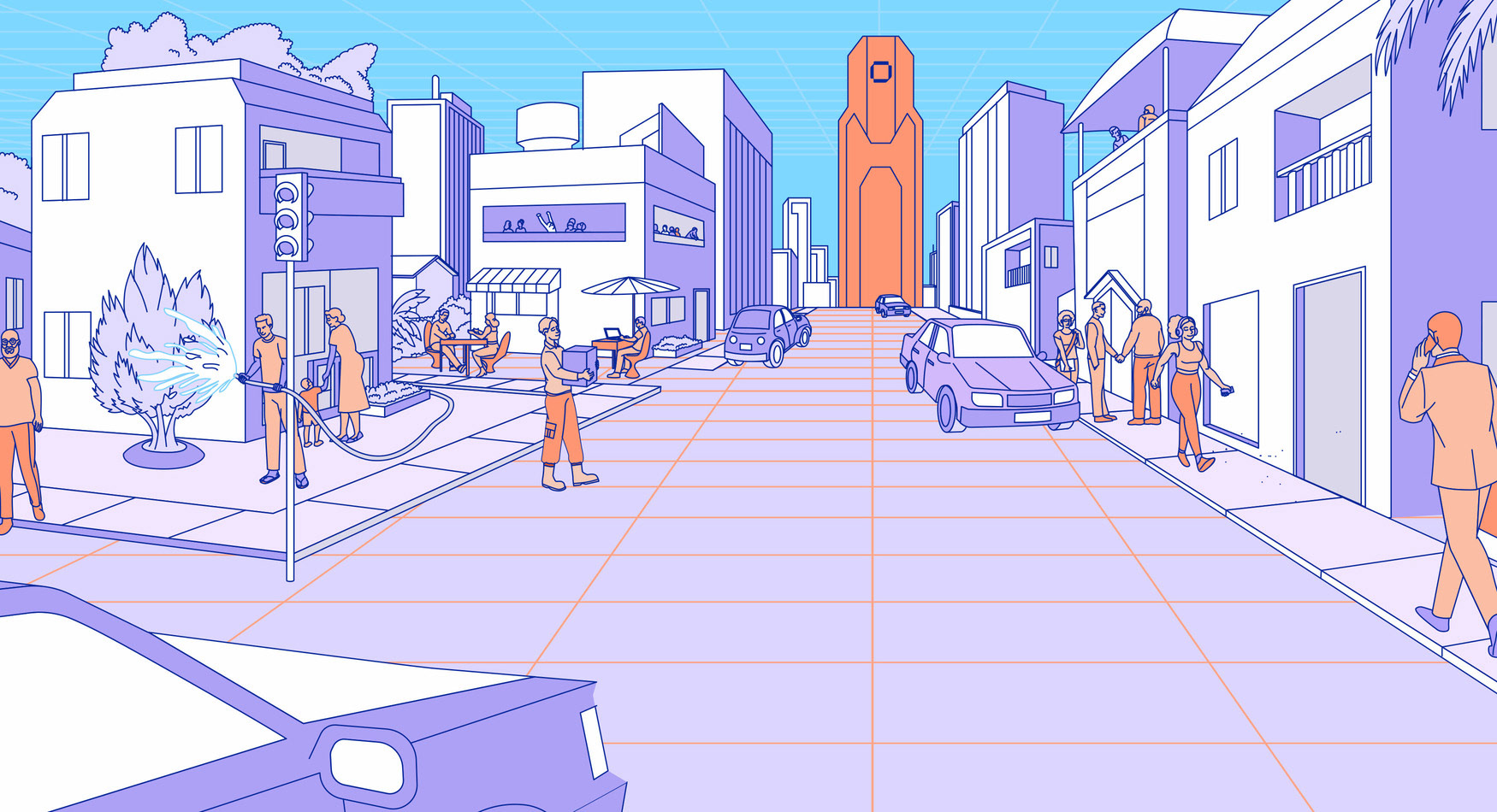
Consonance is an early-stage and growth investment platform with a clear mission: to leverage Africa’s economic potential by backing sustainable and profitable businesses across Sub-Saharan Africa. Founded in 2017, the firm prioritizes quality teamwork, flexibility, and long-term relationships with entrepreneurs. Consonance isn’t just about writing checks; it’s about fostering trust and providing hands-on support for scalable, localized solutions. My goal in rebranding Consonance was to capture its core principles of collaboration, trust, and innovation in a way that visually communicates its deep connection to Africa’s future.
Consonance is an early-stage and growth investment platform with a clear mission: to leverage Africa’s economic potential by backing sustainable and profitable businesses across Sub-Saharan Africa. Founded in 2017, the firm prioritizes quality teamwork, flexibility, and long-term relationships with entrepreneurs. Consonance isn’t just about writing checks; it’s about fostering trust and providing hands-on support for scalable, localized solutions. My goal in rebranding Consonance was to capture its core principles of collaboration, trust, and innovation in a way that visually communicates its deep connection to Africa’s future.
Simple, Profound, Solid
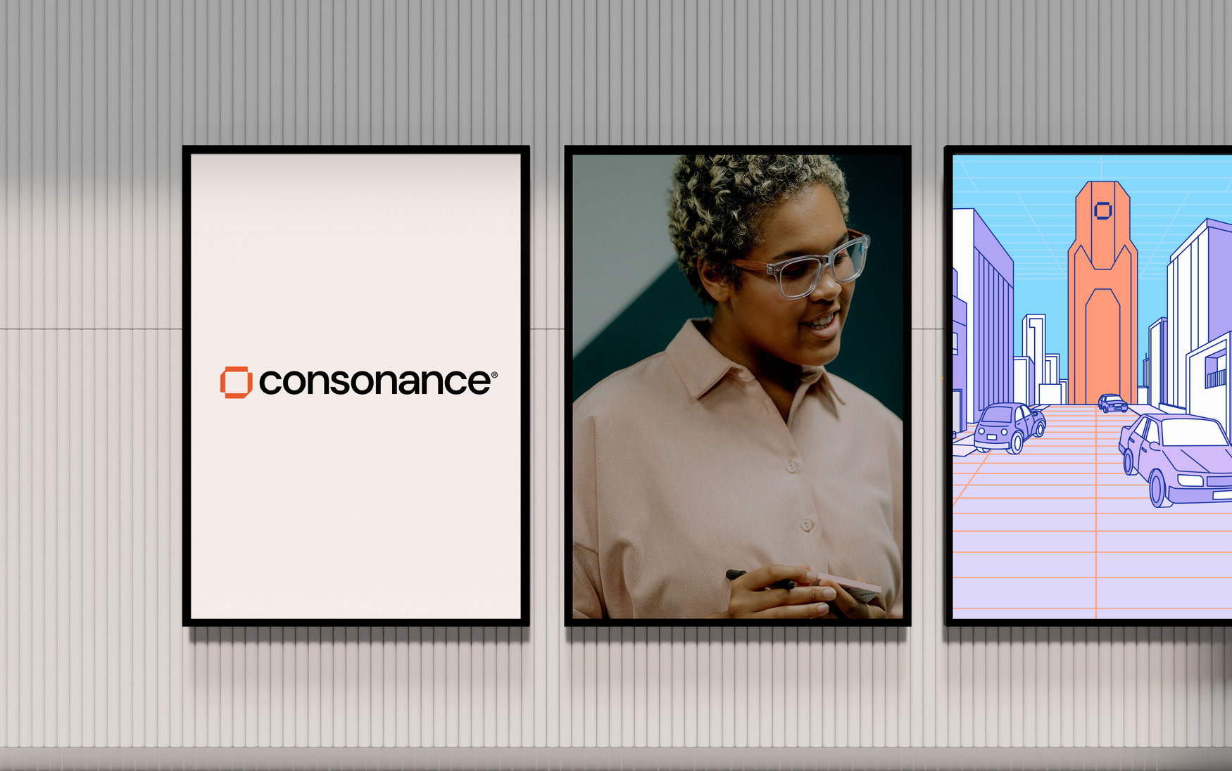
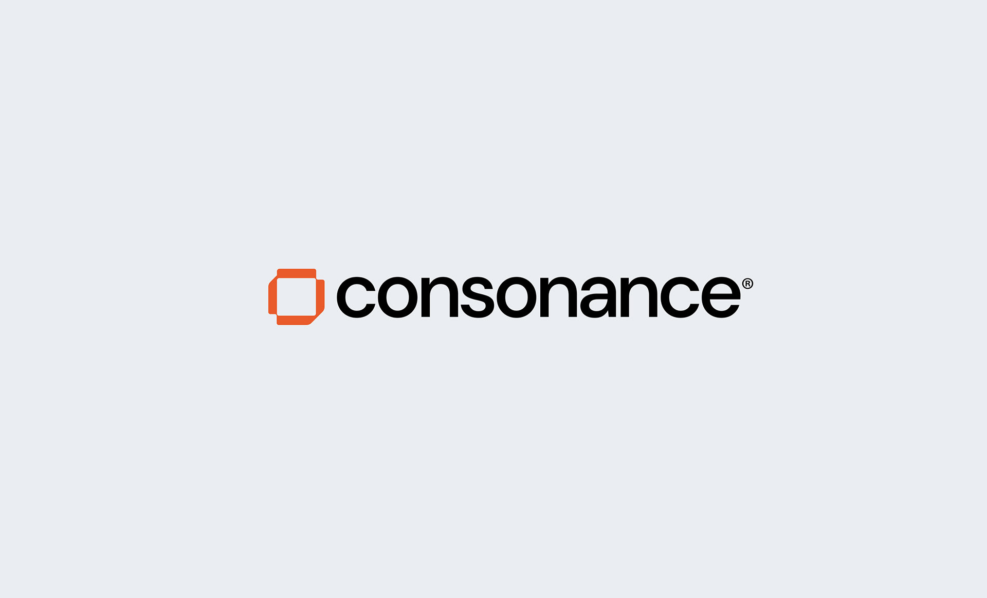
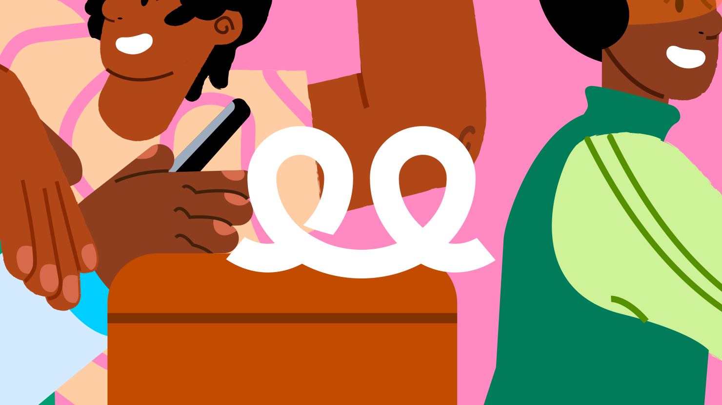
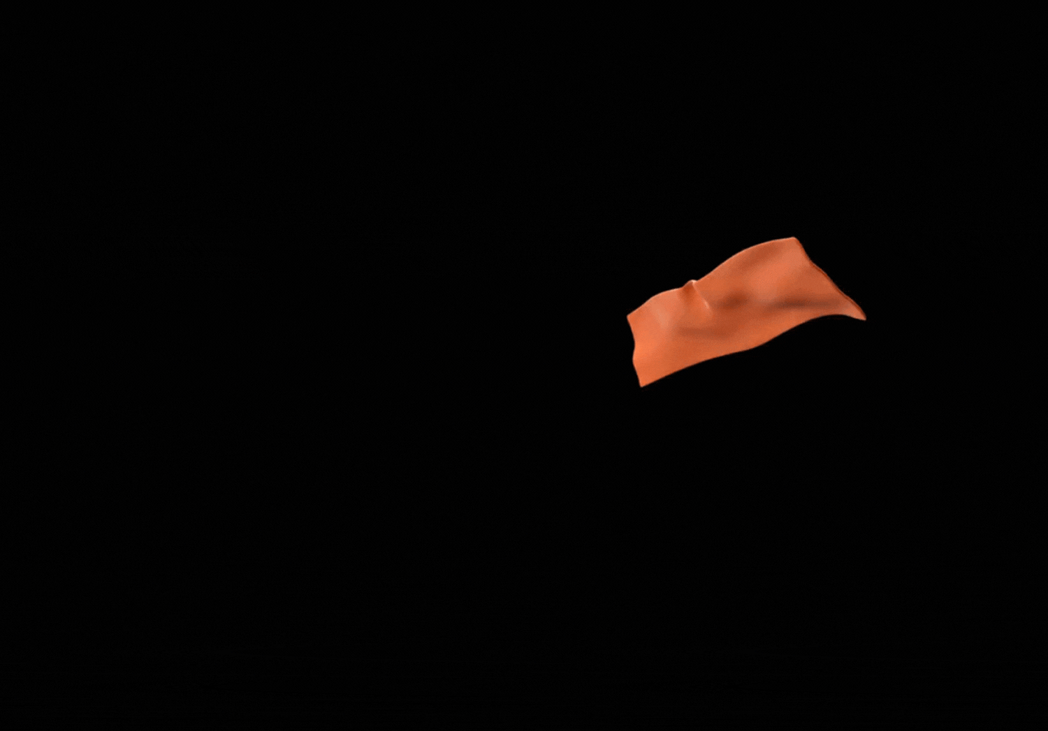
Consonance’s emphasis on people, relationships, and intellectual capital was a key inspiration for my design approach. I created a logo that encapsulates the synergy between Consonance and its clients, reflecting their shared journey. The logo, designed to resemble a Mobius strip, is a mathematical representation of seamless synergy—perfectly illustrating the dynamic partnership between Consonance and the entrepreneurs it supports.
Consonance’s emphasis on people, relationships, and intellectual capital was a key inspiration for my design approach. I created a logo that encapsulates the synergy between Consonance and its clients, reflecting their shared journey. The logo, designed to resemble a Mobius strip, is a mathematical representation of seamless synergy—perfectly illustrating the dynamic partnership between Consonance and the entrepreneurs it supports.
To further emphasize this connection, I chose a color palette rooted in African identity. The primary colors, Consonance Clay and Consonance Black, draw inspiration from Sub-Saharan soil and the rich melanin of African skin, symbolizing the company’s deep commitment to supporting African businesses. These colors gave the brand a strong, authentic visual presence.
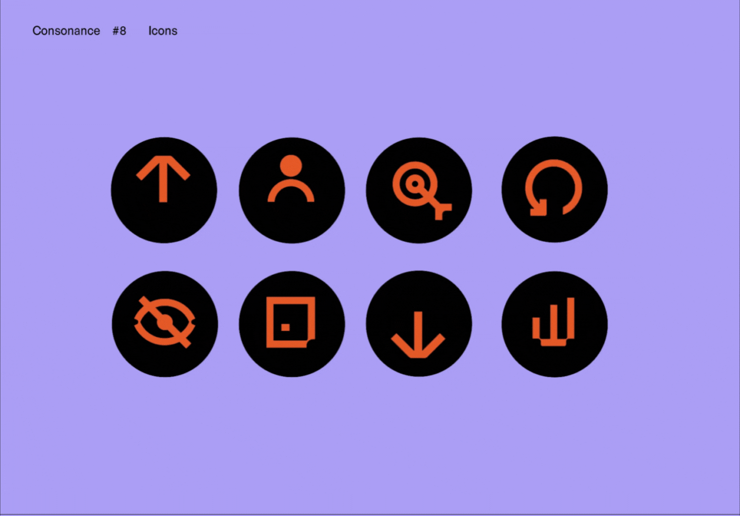
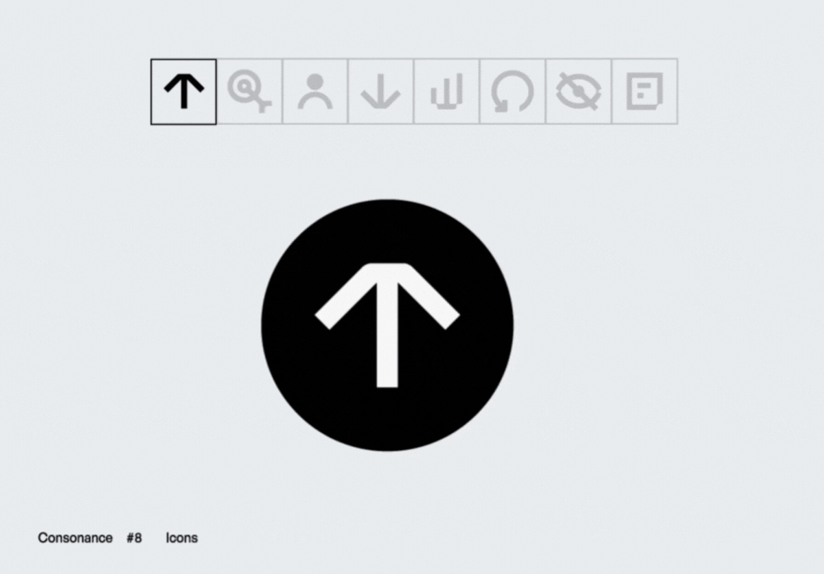
Bold, Geometric Design
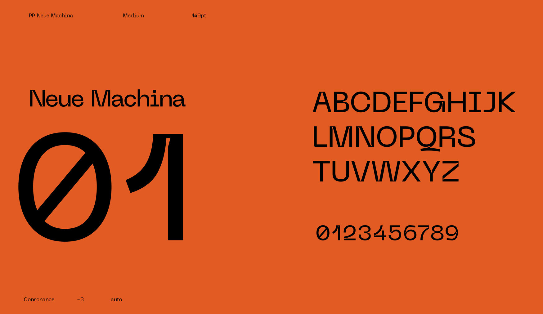
For the typography, I selected PP Neue Machina as the primary font, a geometric typeface that perfectly aligns with the brand’s innovative and forward-thinking ethos. DM Sans, a low-contrast geometric sans serif, was chosen as the secondary font to create a harmonious balance. Together, these typefaces reinforce the modern, clean look of the brand while maintaining a sense of stability and trust.
For the typography, I selected PP Neue Machina as the primary font, a geometric typeface that perfectly aligns with the brand’s innovative and forward-thinking ethos. DM Sans, a low-contrast geometric sans serif, was chosen as the secondary font to create a harmonious balance. Together, these typefaces reinforce the modern, clean look of the brand while maintaining a sense of stability and trust.
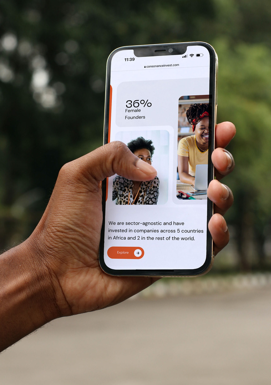
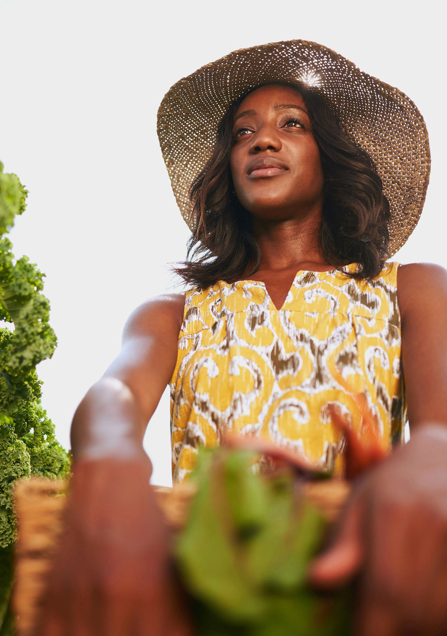
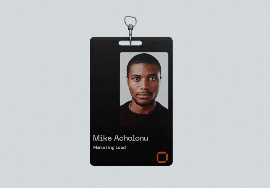
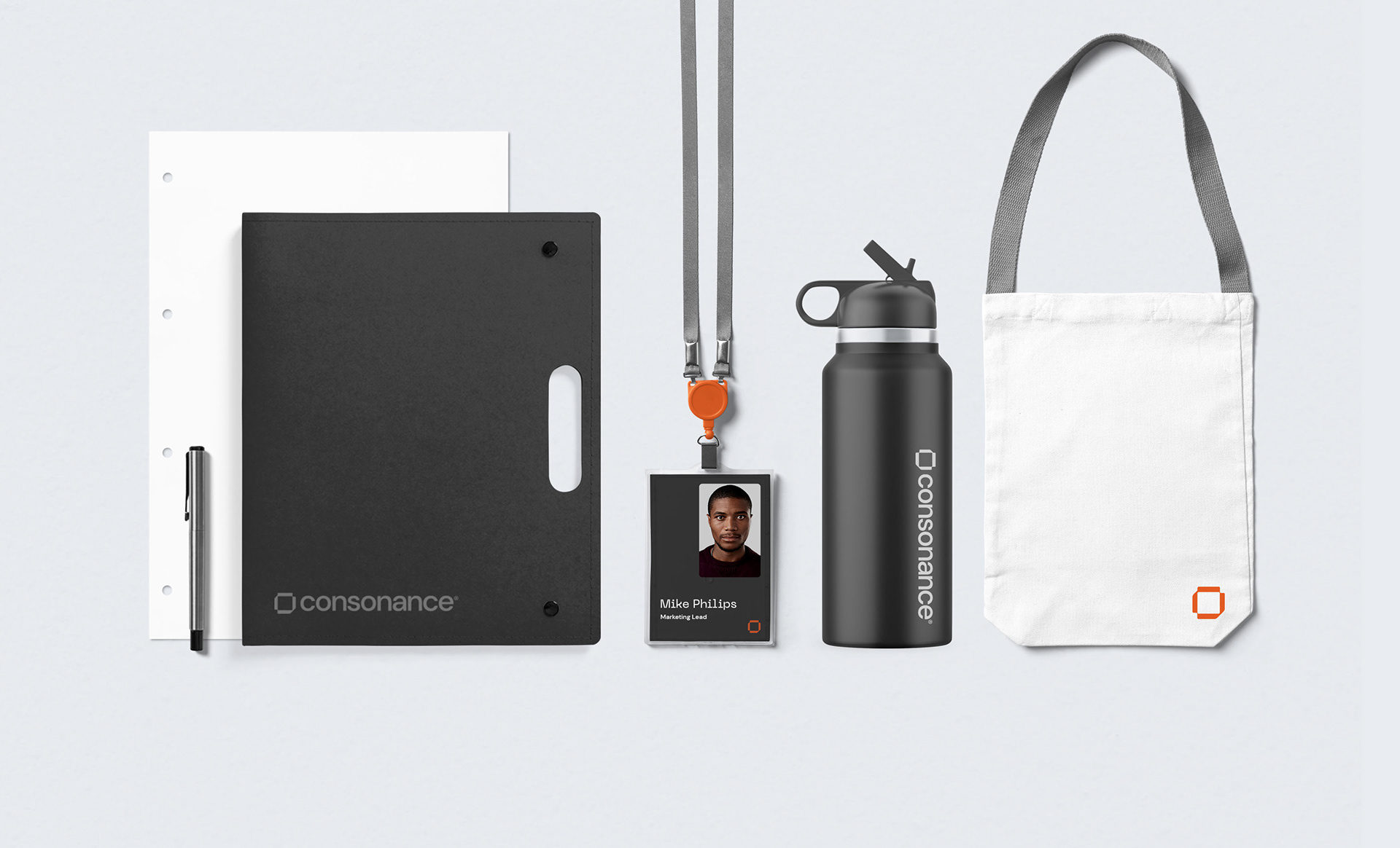
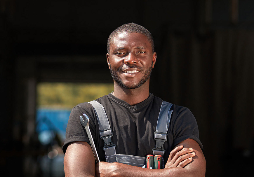
Candid and Impactful Imagery
In keeping with Consonance’s values, I focused on creating imagery that speaks directly to the firm’s mission and approach—transparent, direct, and impactful. The brand’s visual elements were designed to communicate one clear message to clients and partners: what you see is what you get. Consonance’s identity is now a powerful reflection of its commitment to building lasting, trust-based relationships with Africa’s entrepreneurs, while staying true to its roots and purpose.
In keeping with Consonance’s values, I focused on creating imagery that speaks directly to the firm’s mission and approach—transparent, direct, and impactful. The brand’s visual elements were designed to communicate one clear message to clients and partners: what you see is what you get. Consonance’s identity is now a powerful reflection of its commitment to building lasting, trust-based relationships with Africa’s entrepreneurs, while staying true to its roots and purpose.

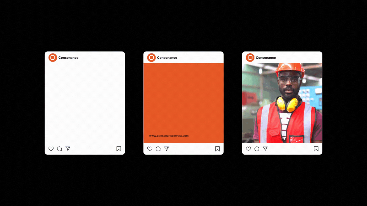


Following this brand architecture, Geneza chose a unique Typeface; PP Neue Machina for its deep ink geometric type features perfectly suited to reflect innovation. DM sans, a low-contrast geometric sans serif design, serves as the secondary brand typeface. Both fonts together are a perfect geometric pairing.