Reimagining Fintech with Thepeer
In 2021, Thepeer was born out of a need for a seamless infrastructure for digital wallet payments and transfers, something that its founders, Kosisochukwu Chike Ononye and Michael "Trojan" Okoh, experienced firsthand. While the African fintech industry was growing rapidly, there was still friction when moving money between different fintech wallets, and Thepeer aimed to solve this. The challenge for me was to reimagine their brand identity to reflect their dynamic, customer-focused, and tech-forward solutions.
In 2021, Thepeer was born out of a need for a seamless infrastructure for digital wallet payments and transfers, something that its founders, Kosisochukwu Chike Ononye and Michael "Trojan" Okoh, experienced firsthand. While the African fintech industry was growing rapidly, there was still friction when moving money between different fintech wallets, and Thepeer aimed to solve this. The challenge for me was to reimagine their brand identity to reflect their dynamic, customer-focused, and tech-forward solutions.
Peerless Innovation
Thepeer, dedicated to delivering fast and reliable payment experiences, grew into a leading payment processor by 2023. Its mission is to unify Africa’s digital payments landscape, simplifying transfers for businesses and consumers alike. As the Lead Brand Designer, I worked closely with the team to create a vibrant, modern identity system that reflected Thepeer’s emphasis on quality, stability, and customer service.
Thepeer, dedicated to delivering fast and reliable payment experiences, grew into a leading payment processor by 2023. Its mission is to unify Africa’s digital payments landscape, simplifying transfers for businesses and consumers alike. As the Lead Brand Designer, I worked closely with the team to create a vibrant, modern identity system that reflected Thepeer’s emphasis on quality, stability, and customer service.
Vibrant, Seamless Technology
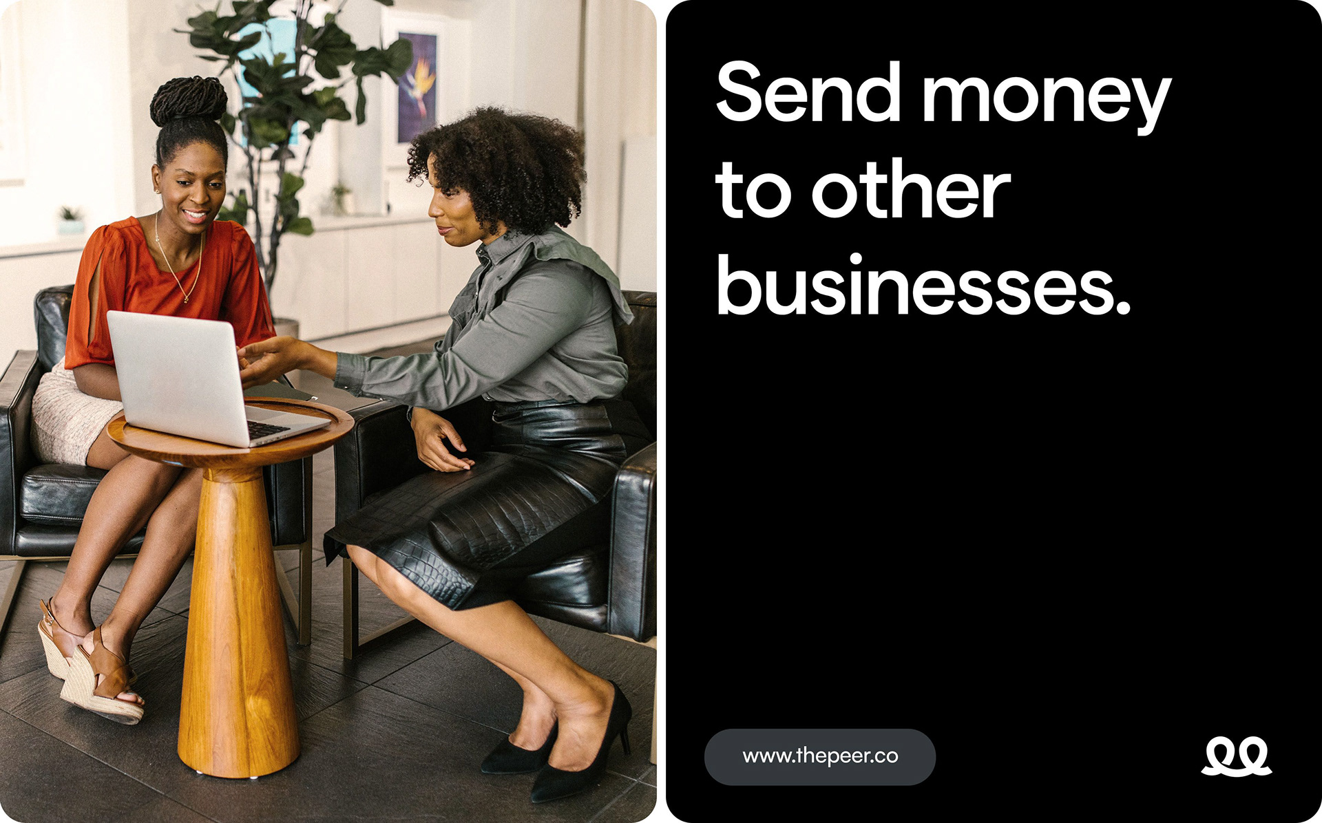
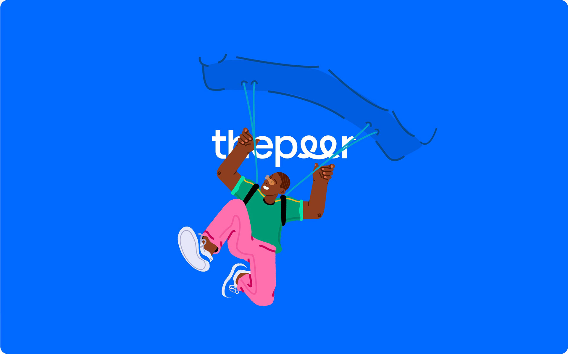
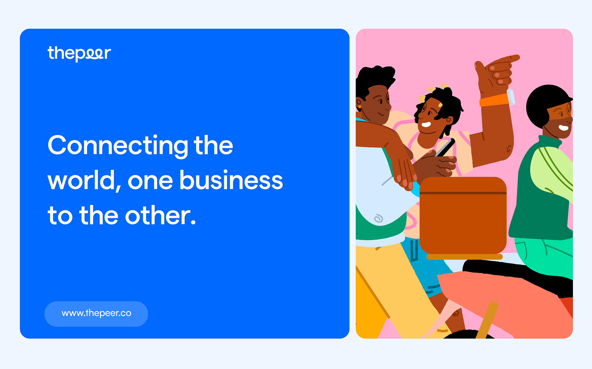
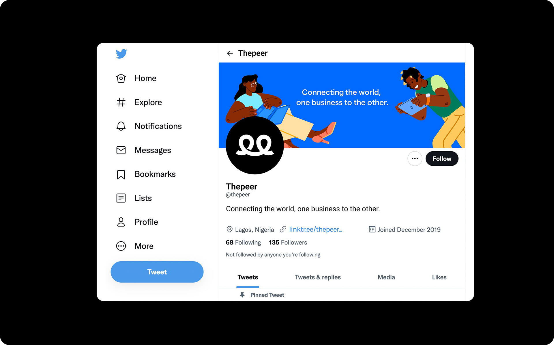
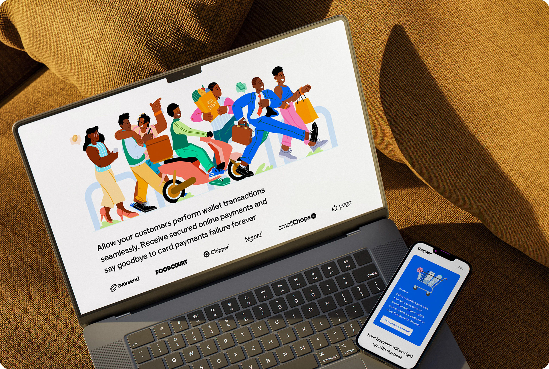
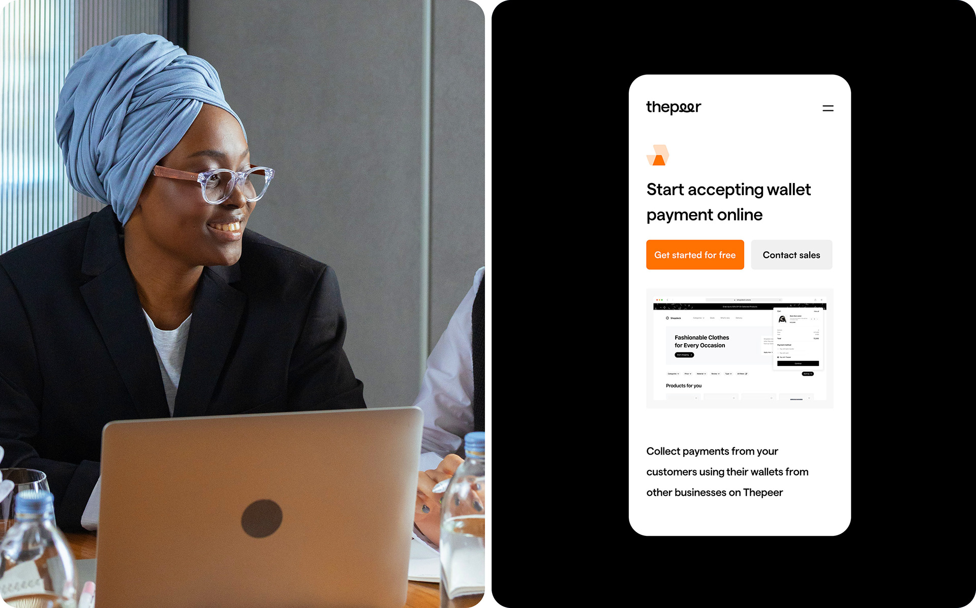
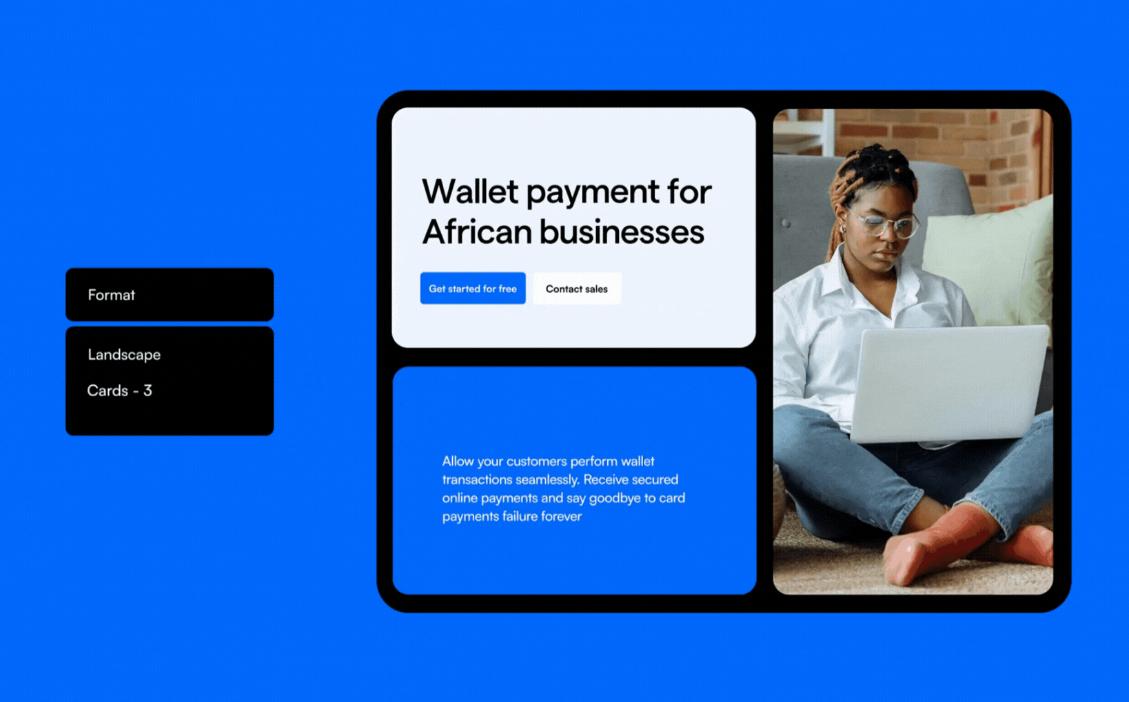
A major shift in Thepeer’s visual identity was crucial to differentiating the brand in the crowded fintech space. I carefully selected a bold color palette—Thepeer Black, Blue, Orange, Pink, Sky-blue, and Green—to convey the brand’s energy, growth, and diverse user base. These colors are not typically seen in fintech, making Thepeer stand out while still maintaining a sense of professionalism.
A major shift in Thepeer’s visual identity was crucial to differentiating the brand in the crowded fintech space. I carefully selected a bold color palette—Thepeer Black, Blue, Orange, Pink, Sky-blue, and Green—to convey the brand’s energy, growth, and diverse user base. These colors are not typically seen in fintech, making Thepeer stand out while still maintaining a sense of professionalism.
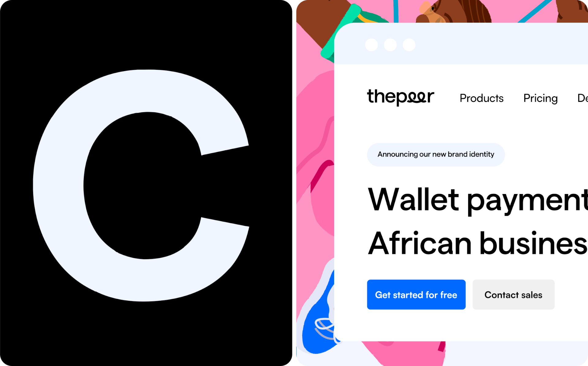
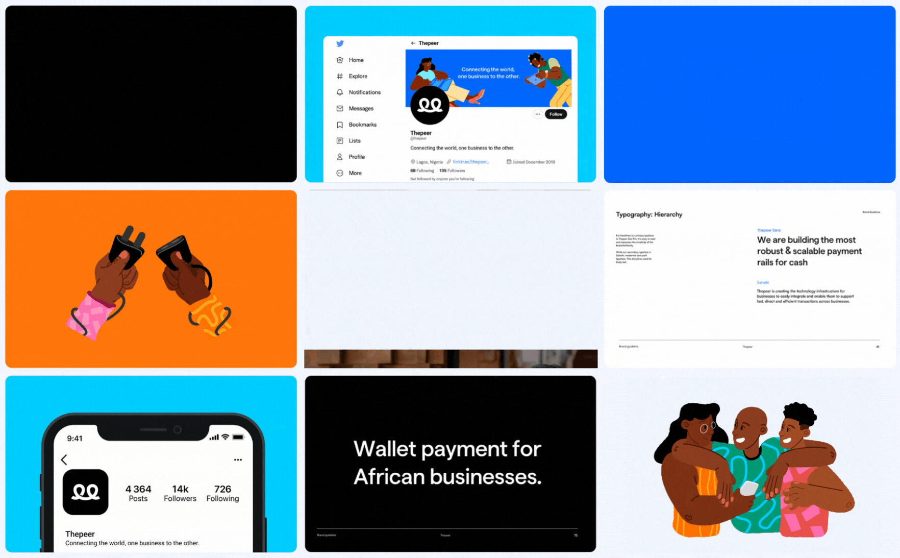
Recognizing that Thepeer straddles both finance and data, I designed a custom logotype that highlights interconnectivity—a key aspect of the brand. The looped double ‘E’ in the logo symbolizes seamless connections between businesses and customers and can also function as a stand-alone icon, representing the ease of digital payments facilitated by Thepeer.
Tailor-made User Experience
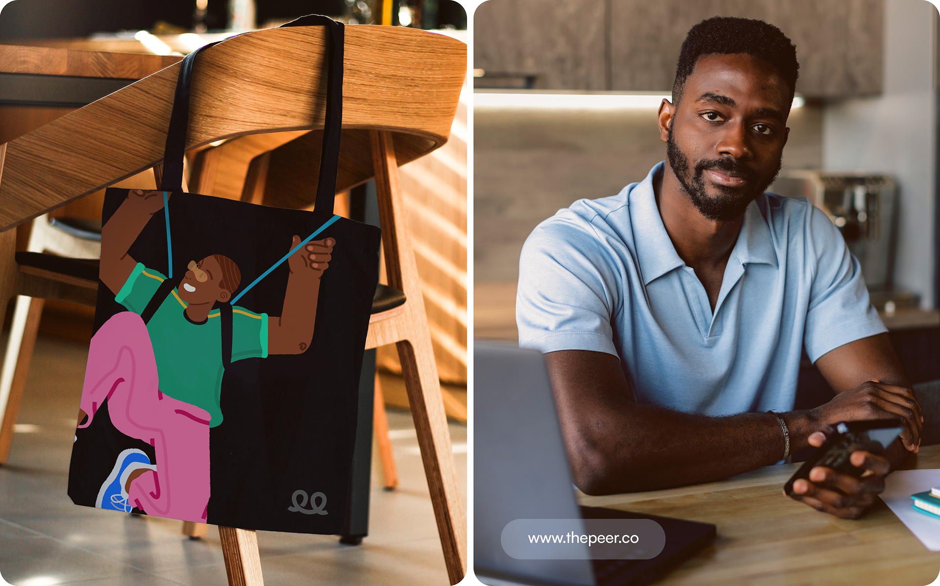
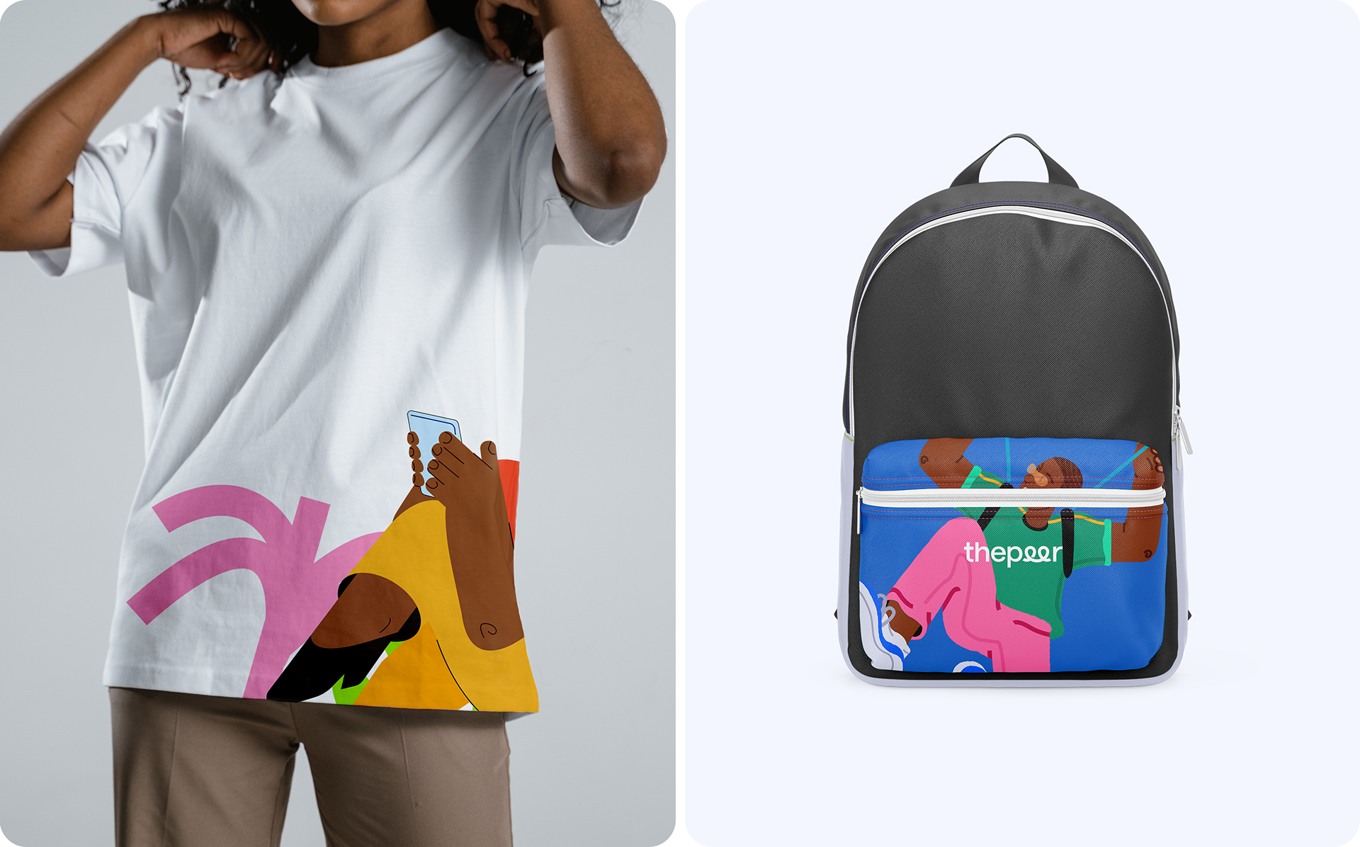
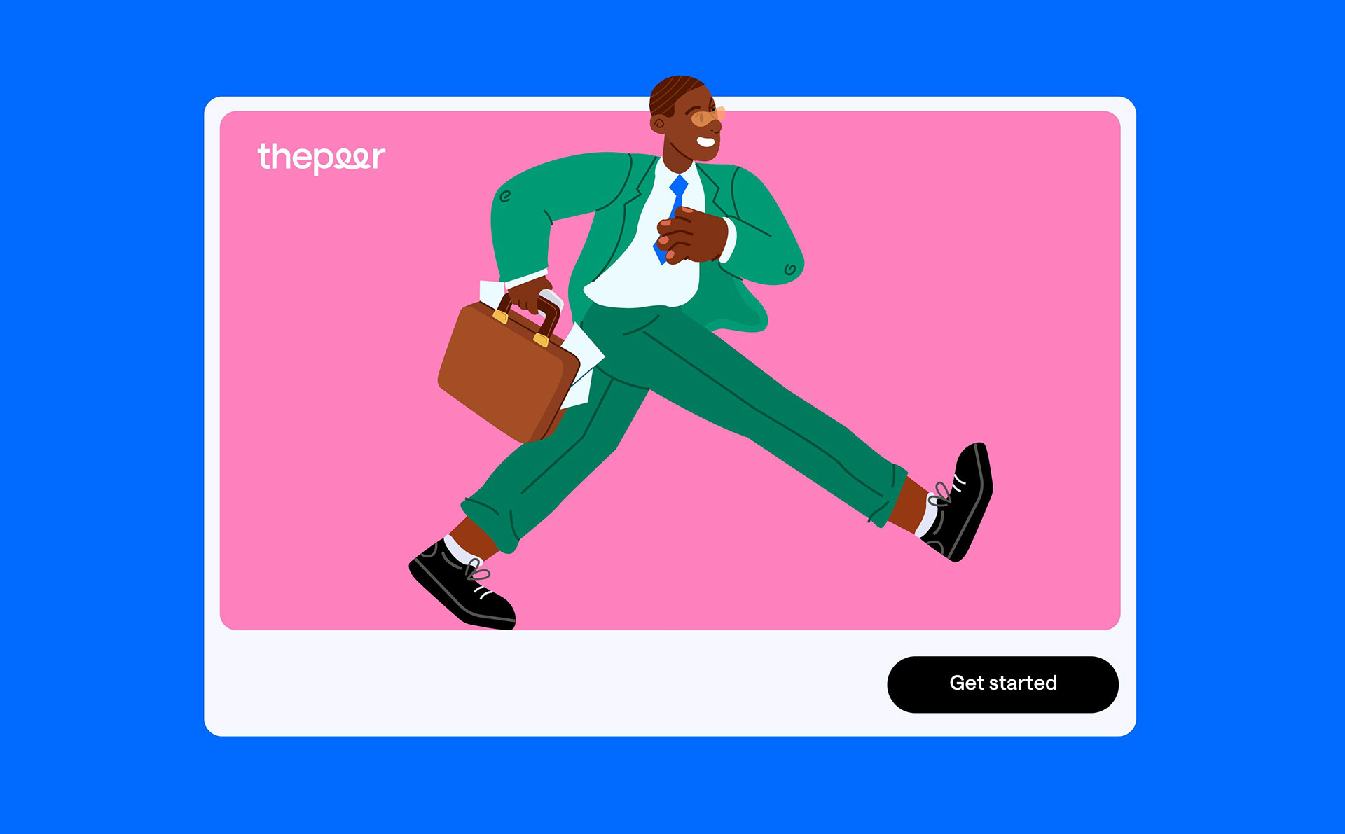
For the photography, I took a human-centered approach, capturing real people and real stories that reflect Thepeer’s empathetic, customer-first culture. This allowed the brand to project authenticity while showcasing its innovative spirit and the real-world impact it has on customers.
For the photography, I took a human-centered approach, capturing real people and real stories that reflect Thepeer’s empathetic, customer-first culture. This allowed the brand to project authenticity while showcasing its innovative spirit and the real-world impact it has on customers.
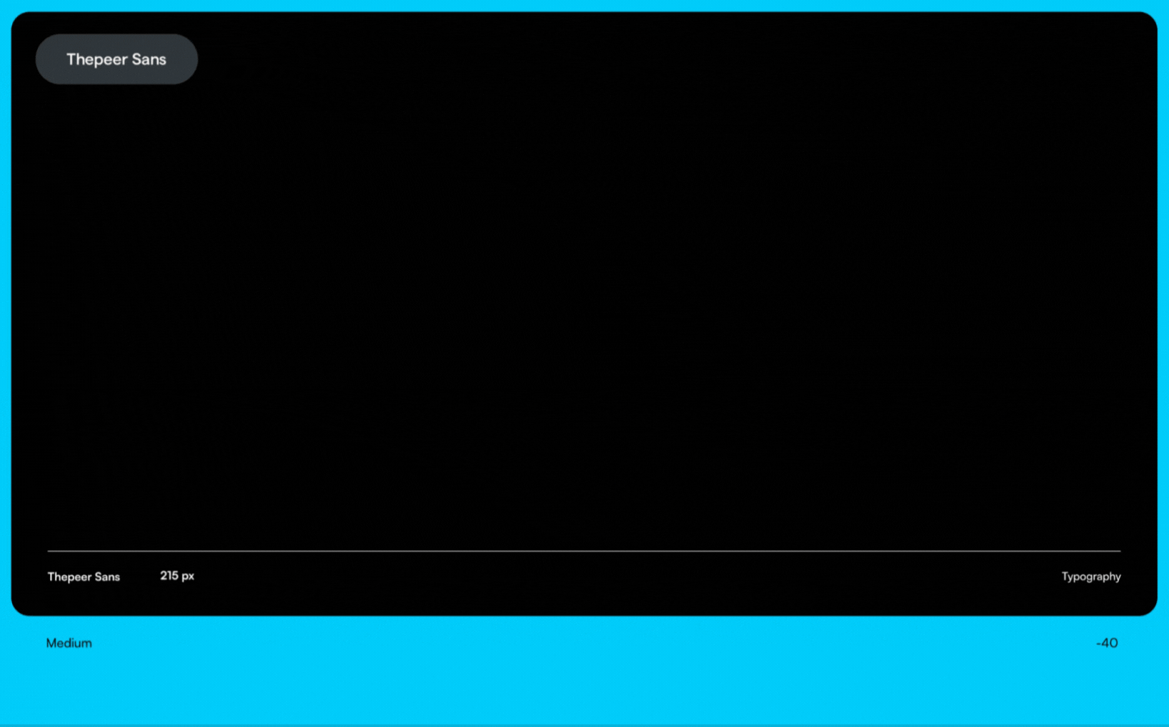
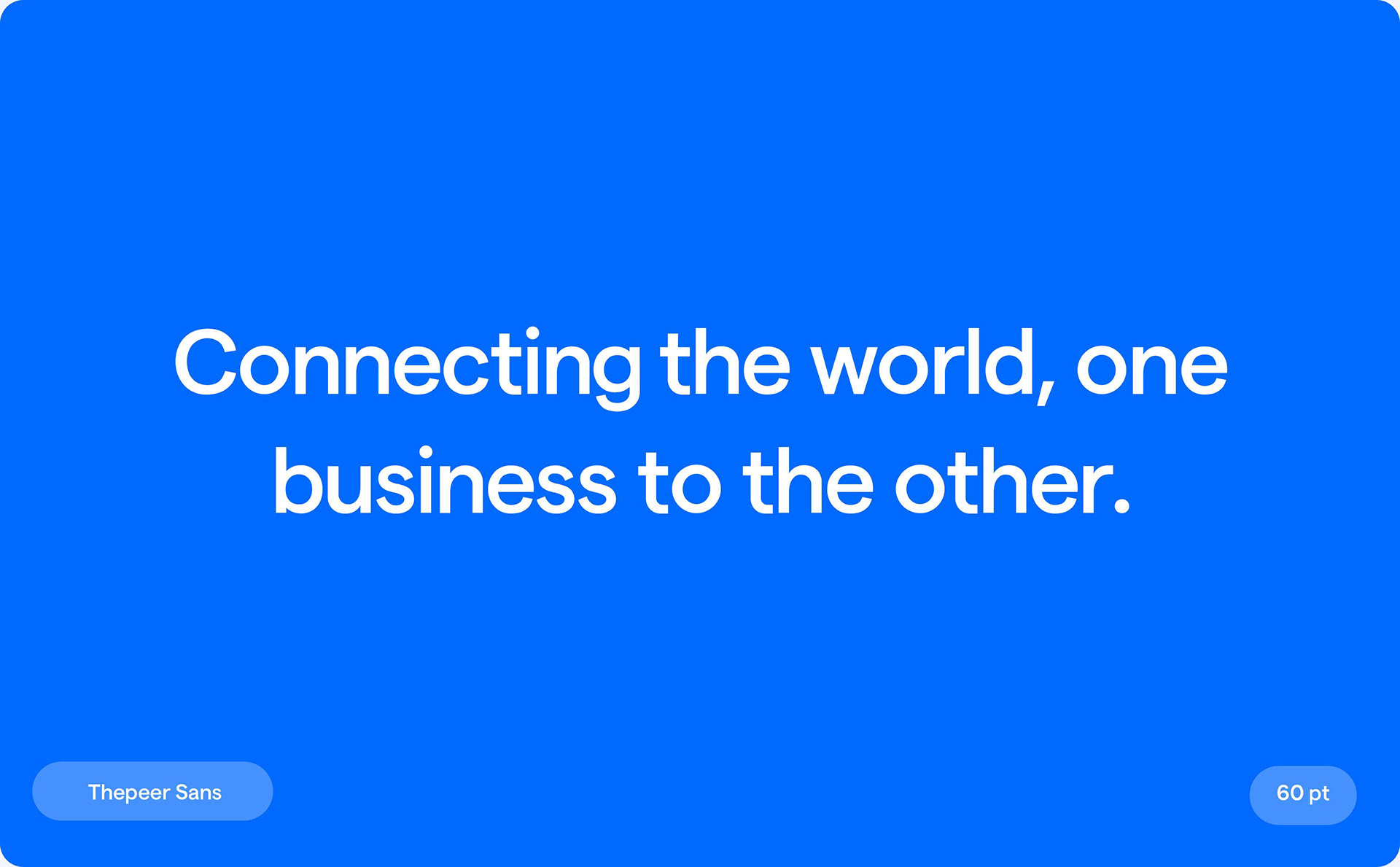
To maintain clarity and brand consistency, I designed a custom typeface, Thepeer Sans, which is geometric, easy to read, and visually appealing. Paired with the sleek Satoshi font, the type system communicates authority and precision, giving the brand a polished yet approachable feel.
Customer-Focused Solutions
Thepeer’s new identity is designed to thrive on digital platforms, but its adaptability ensures it works across various mediums. The brand now stands out as progressive, trustworthy, and customer-centric, appealing to businesses and clients who appreciate Thepeer’s innovative approach to moving money seamlessly and securely.
Thepeer’s new identity is designed to thrive on digital platforms, but its adaptability ensures it works across various mediums. The brand now stands out as progressive, trustworthy, and customer-centric, appealing to businesses and clients who appreciate Thepeer’s innovative approach to moving money seamlessly and securely.


For clear and concise brand messaging and to maintain Thepeer's reputation for exceptional quality, Geneza created a custom typeface called Thepeer Sans. Thepeer Sans is a unique font that is hand-drawn, neat, and has each letter crafted in a geometric, san-serif structure that is simple to read and pleasing to the eye.

A significant change in the brand's appearance was a crucial component of this rebranding effort. Geneza chose to experiment with a wide spectrum of hues that are uncommon in the financial ecosystem but are also not wholly out of place since it was aware of how crucial and strategically essential colors are to brand positioning and exposure. Thepeer Black, Blue, Orange, Pink, Sky-blue, and Green were selected as the brand's colors in order to symbolize the brand's vigor, commitment to growth, and customer diversity.


Thank you.